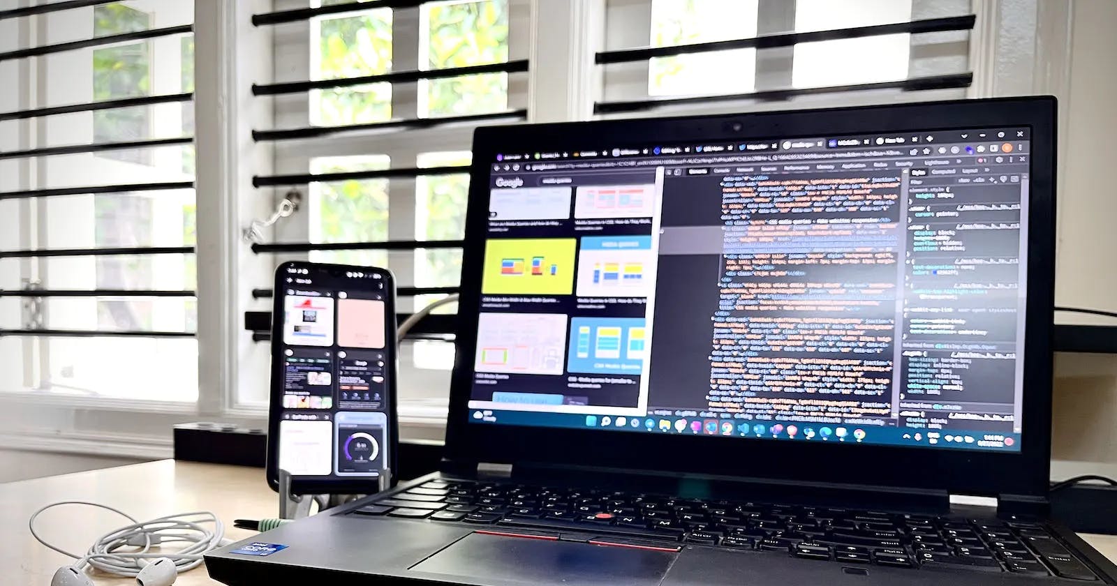
Supporting Media Queries for Mobile, Tablet, and Desktop Screens
Perfect Media Queries for all screens? how to use it?
Nowadays in a rapidly increasing world, there is an increasing variety of devices, all of us are using different devices for our comfort and use to access content on the web. In which the screens are of different sizes, media types, screen/viewport sizes, and resolutions it's our duty as a developer and also makes sense to architect our app's design to adjust to varying devices to fit all screens no matter what is the screen size's and resolutions they are using. Finally, we need to provide a perceptual user experience.
I used Chrome's Responsive Web Design Tester Tool to simulate different viewport dimensions of devices such as Pixel, Samsung, iPhone 12/13, iPad Air, iPad Mini, and laptops, to get the resolutions of how my app looks on different screen sizes. Anyhow, whenever I was switching between different screens/viewports other than a desktop view, I was shocked at how my app was breaking at different breakpoints/viewports. Not only the images, but even the text was also small, with some bulge, and breaking over-lapping one on another was very irritating. So, that's when I decided to turn to media queries.
Here I have explained and given the media queries for Desktops, Tablets, and Mobile with Orientations
Media queries are more powerful tools given by CSS3 / SCSS to provide how the content of your website/app adjusts to every device's size, viewport/screen size, and orientation.
The basic syntax for media queries consists of the keyword @media followed by media type and expression(s)
@media < media-type > and (expression) {
     /* your CSS style */
}
# Media Types
all - includes all devices
print - used for displaying content in the print-preview mode
screen - includes mobile, tablet, and desktop devices.
# Expressions
Expressions are the ones where we define the actual width/height of the screen to deploy your app/website.
For example, for the query for the media and device with a viewport width of 325px (mobile), the background color of the inside span tag should be blue.
@media and screen and (width: 325px) {
    span {
     background-color: blue;
    }
}
Media Query for Desktop :
@media only screen and (max-width: 1200px) {
    .p {
        background-color: #ffcc00;
    }
}
Media Query for Tablets :
@media only screen and (min-width: 481px) and (max-width: 768px) {
    .p {
        background-color: #000000;
    }
}
Media Query for Mobiles :
@media only screen and (min-width: 480px) {
    .p {
        background-color: #bb0000;
    }
}
Orientations for Screens :
1. Portrait :
@media only screen and (orientation: portrait) and (max-width: 480px) {
    .p {
            background-color: #bb0000;
        }
  }
2. Landscape :
@media only screen and (orientation: landscape) and (max-width: 480px) {
    .p {
            background-color: #bb0000;
        }
  }
For more about the media quires you can check here.
And, hey! there you have a responsive website/app which you need to develop. I Agree, there will be complex media queries depending on the complexity of your app but hopefully, this basic knowledge of media queries will get you started on your journey to master building responsive web apps.
Happy Coding !!!
